Sound, that
sounds better.
and sound design for businesses.
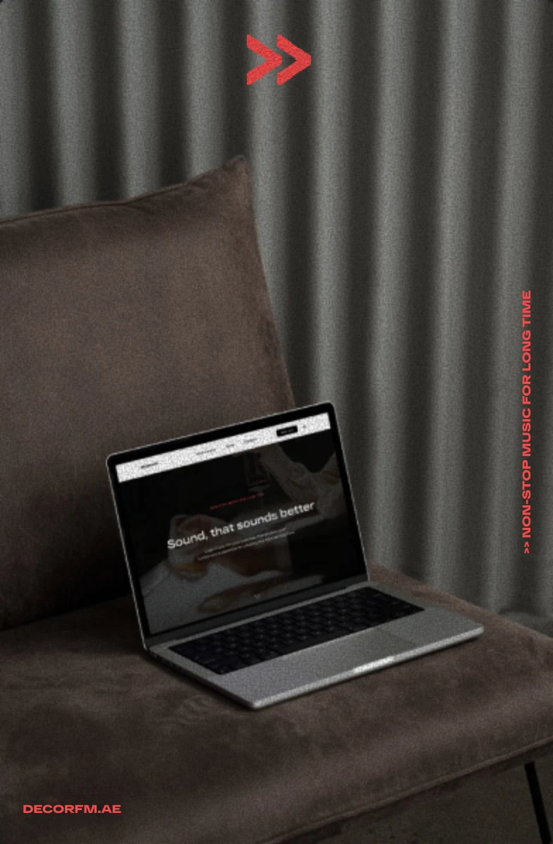
Not background.
Atmosphere.
Music changes how a place feels. The design turns that invisible experience into something people can see, explore and enquire about.
The original landing page connects a clear service introduction, mood-led playlists and a direct contact flow. A double-chevron motif gives the visual system its sense of forward movement.
- Areas of work
- Web design
Visual communication - Design focus
- Responsive layouts
Mood playlists / CTA flow
#F64B4B#1C1C1C#FFFFFF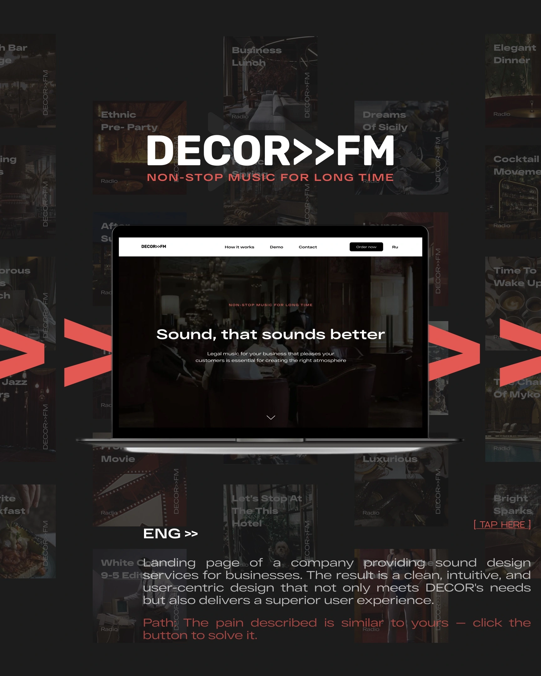
One story.
Every screen.
The page moves from atmosphere to understanding: discover the offer, explore the mood, then start a conversation. The original desktop and mobile layouts preserve that sequence at different scales.
Explore the live websiteSet the mood.
Image-led hero and a clear service promise.
Hear the direction.
Mood playlists, service steps and benefits.
Start a dialogue.
A visible enquiry path and contact form.
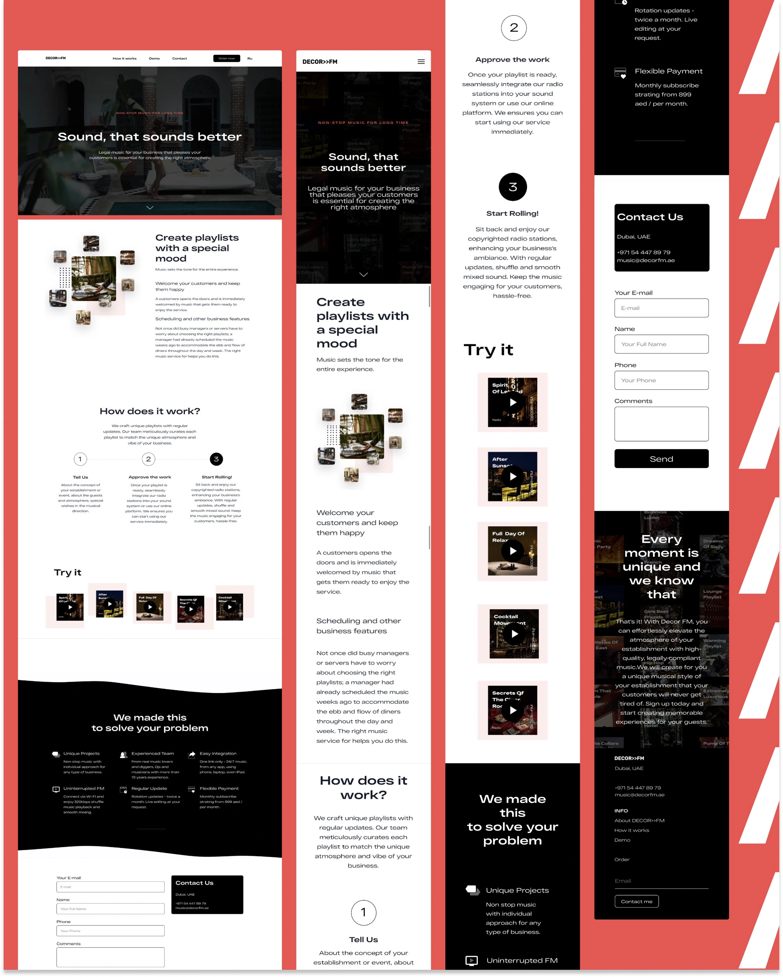
Original design presentation. Any offer or pricing visible inside the artwork is historical design content, not a current quotation.
Different spaces.
A recognisable signal.
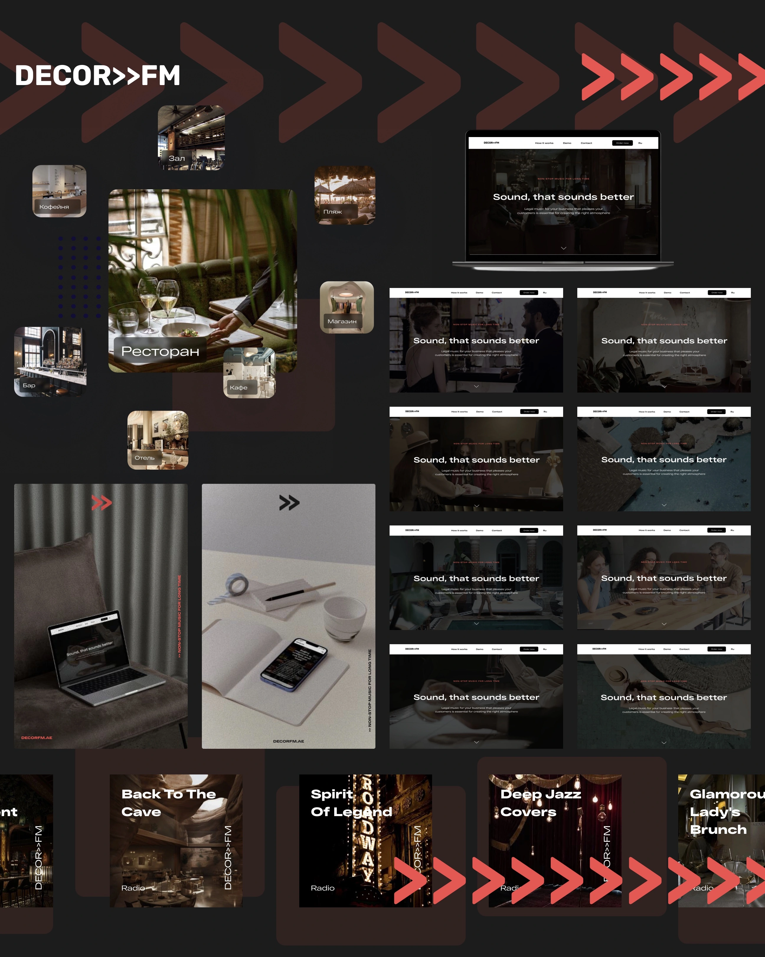
Hospitality, retail and everyday places share one visual language. Photography carries the atmosphere; playlist covers, device compositions and the repeated chevron connect the touchpoints.
Original website imageryCampaign & playlist artwork
From a room’s character
to a brand’s rhythm.
not a list of named client projects.
Beyond the screen.
Into the room.
Two new graphic studies explore how the existing red, black and double-chevron language could become physical touchpoints: a listening card and a room poster.
Concept studiesNot produced client materials

01
A LISTENING
STUDY
EVENING / AFTER HOURSCONCEPT
EDITION
LISTENINGROOM / 01
A
SENSE
OF
PLACE.
Set the mood.
Keep it moving.