Vital
Quiet rituals.
Considered forms.
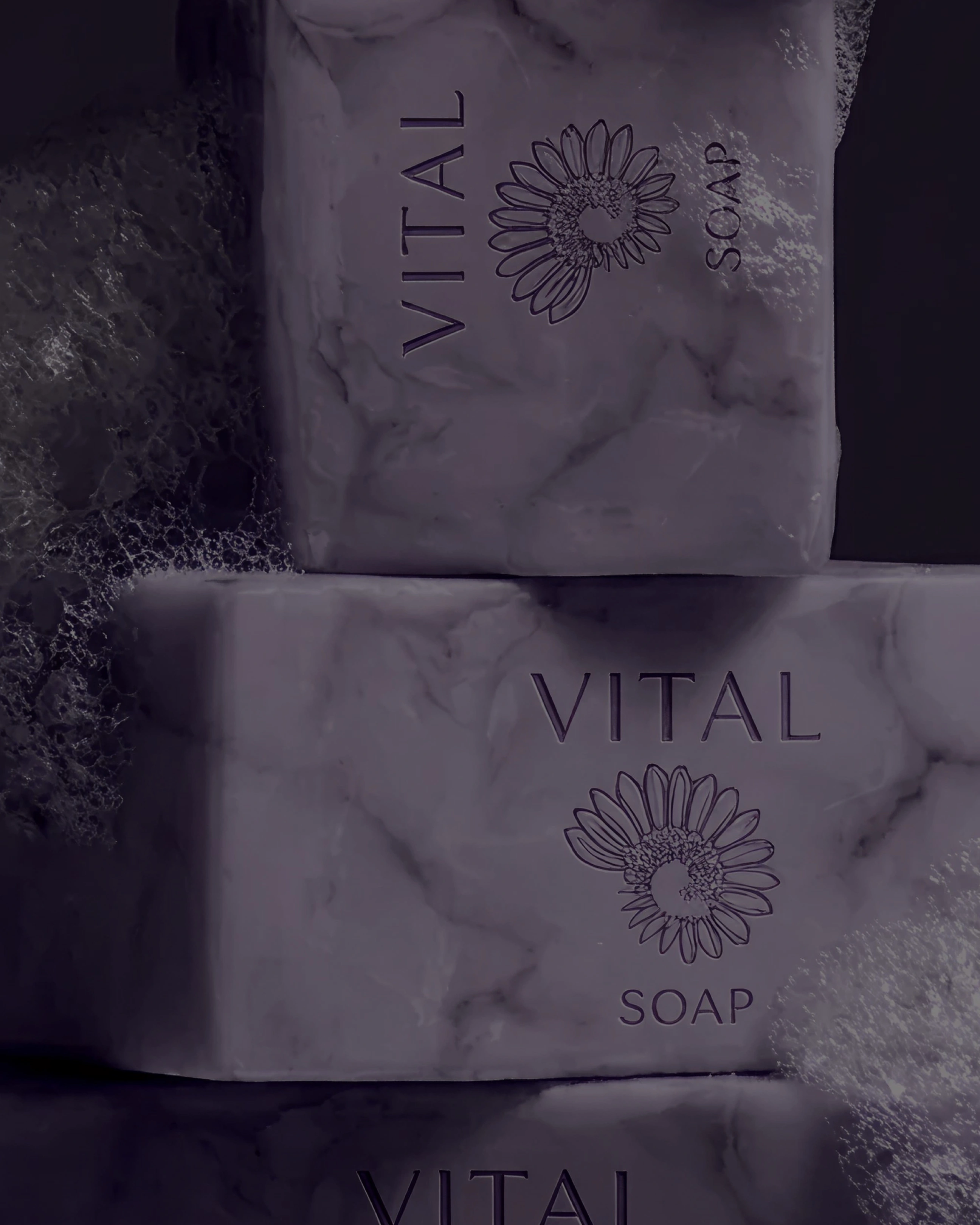
A softer
kind of presence.
A lavender-led visual identity carried by a fine serif wordmark, a floral spiral and a quiet contrast between deep purple and warm ivory. The system connects the everyday objects without making them all feel the same.
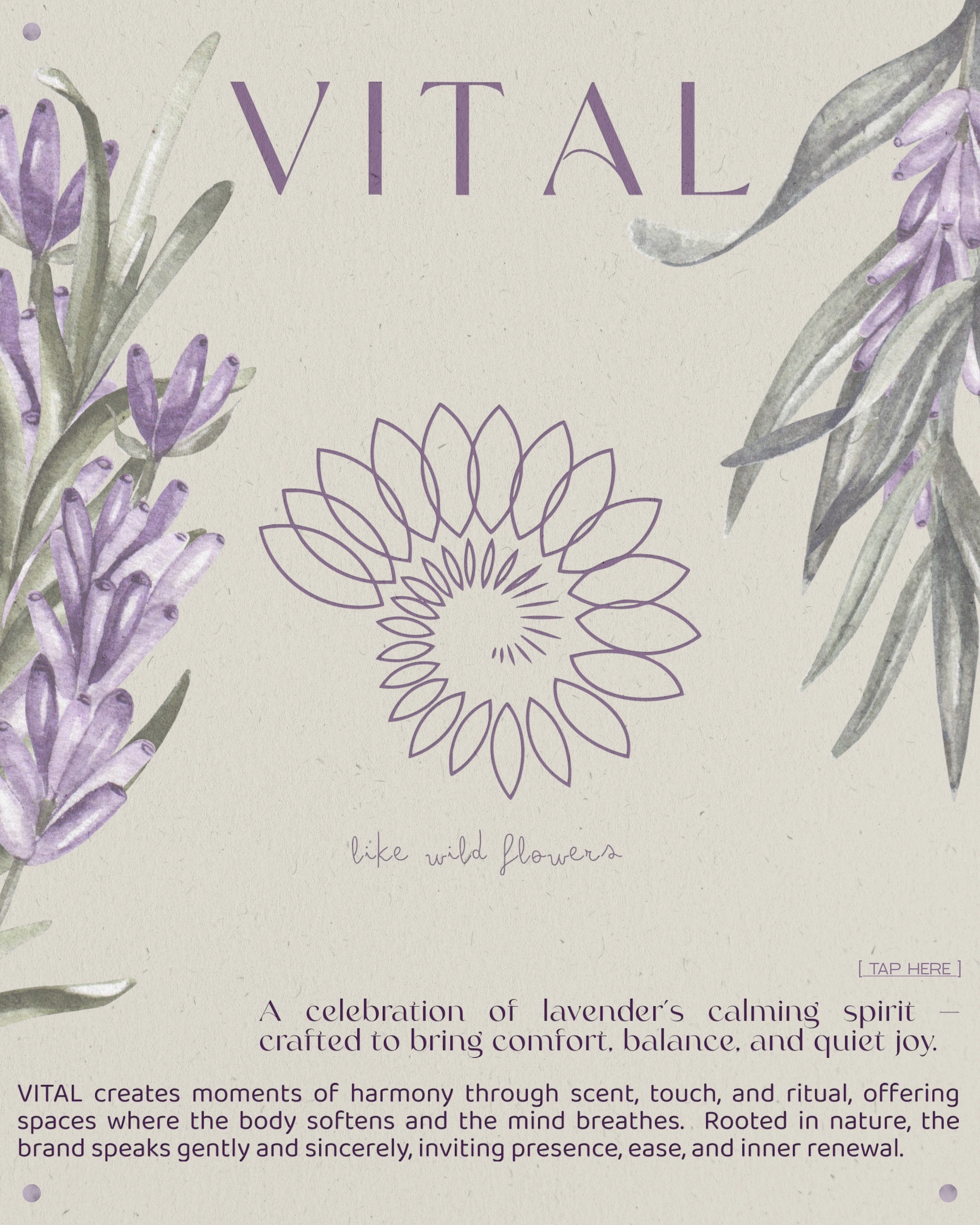
Like wild
flowers.
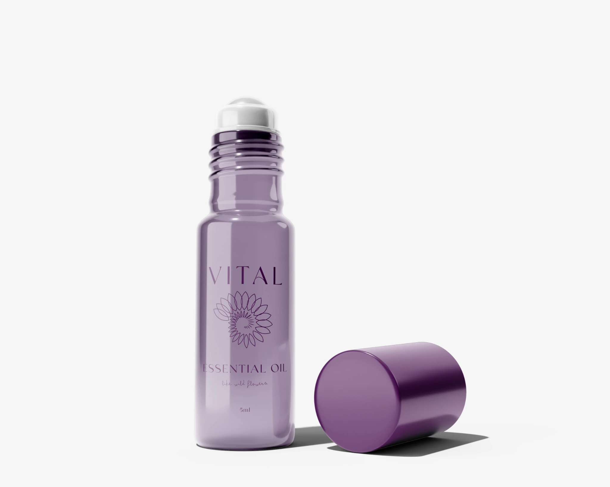
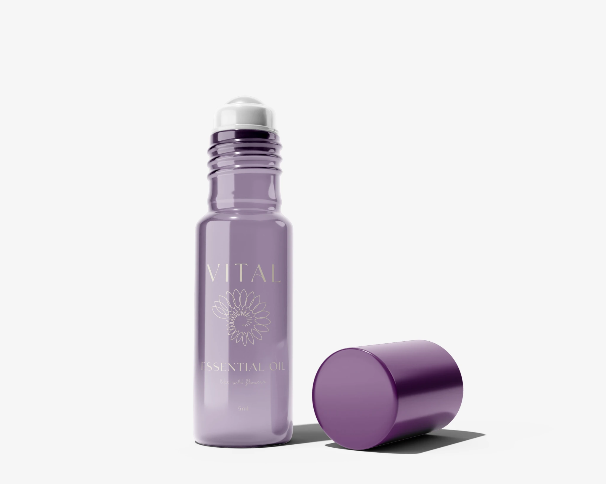
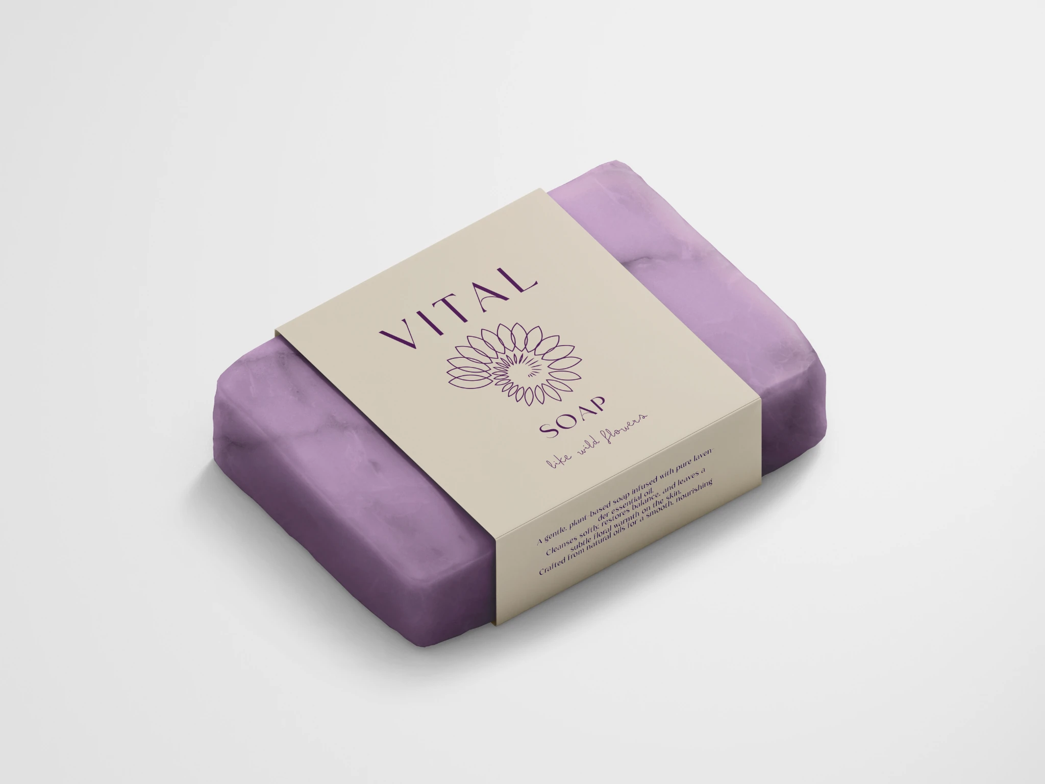
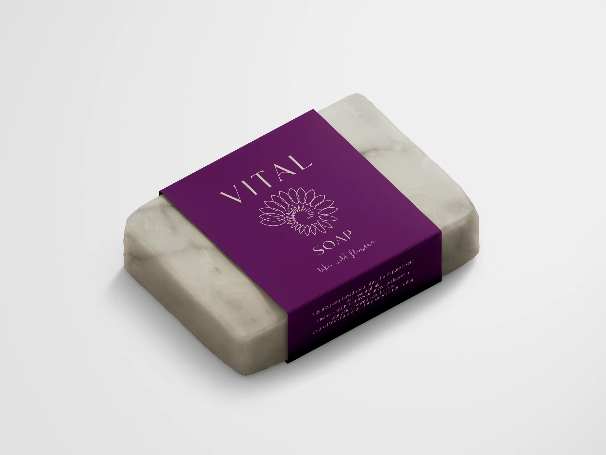
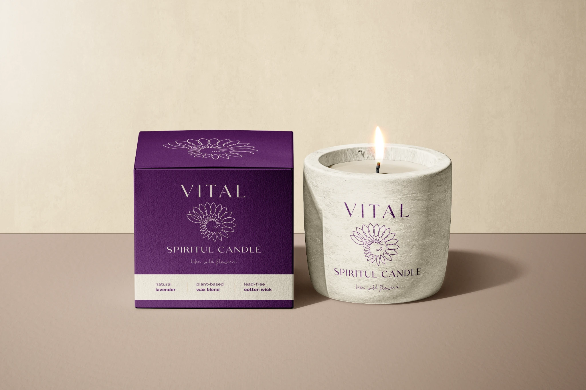
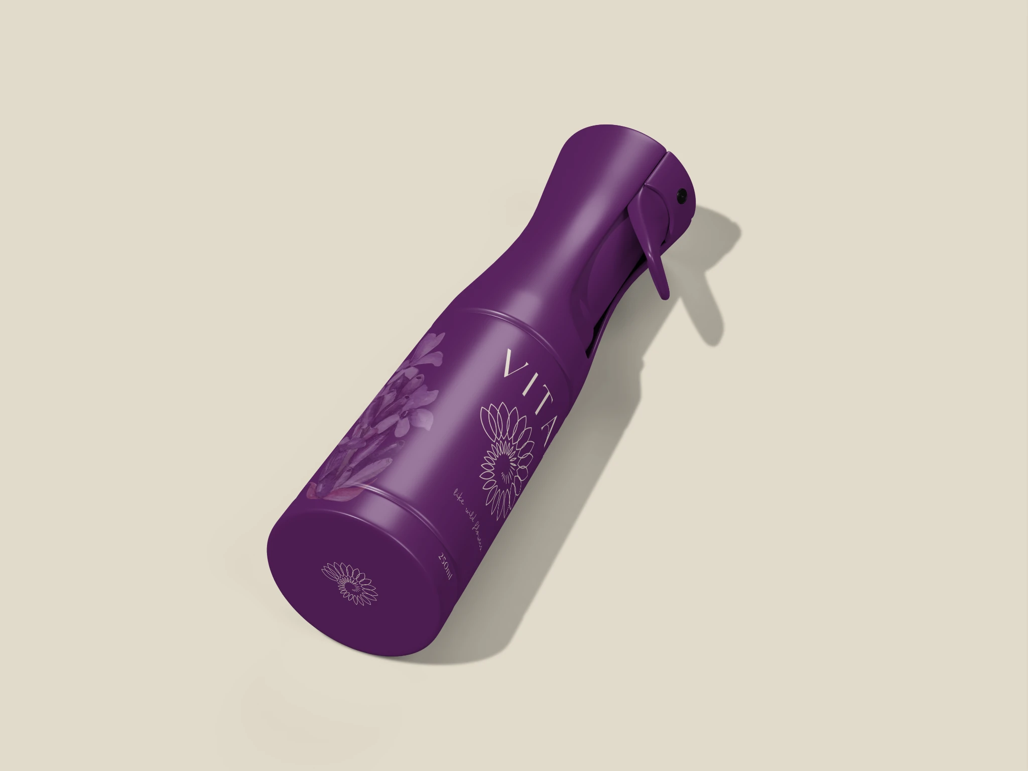
#56205B#D9D2C2Botanical illustration, delicate linework and a handwritten note give the identity a human softness. On the product studies, the same mark shifts between print, colour and a tactile-looking embossed treatment.
- Project focus
- Visual identity
Packaging & label design - Selected applications
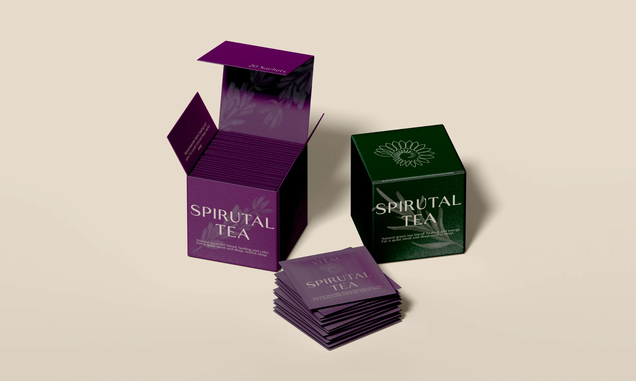
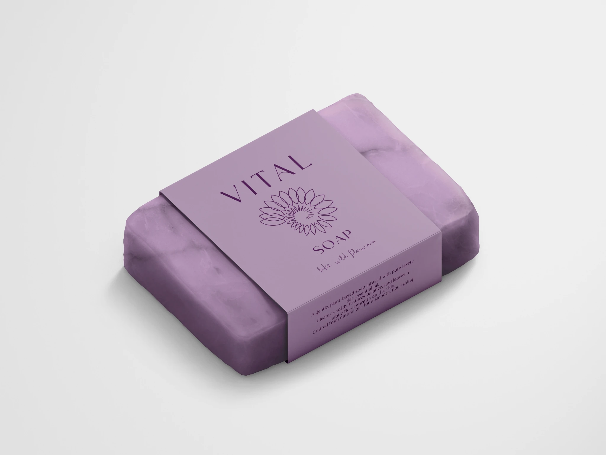
- Tea / Essential oil / Soap
Candle / Room freshener
One visual language.
Many daily moments.
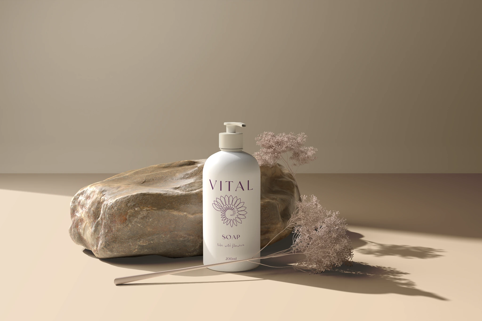
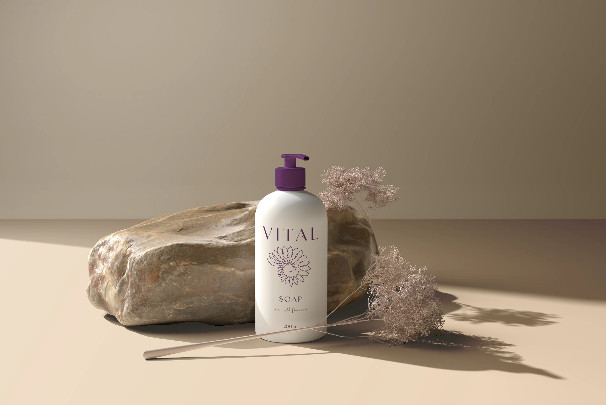
The original application board brings the packaging into a shared visual world: warm light, mineral textures, lavender tones and simple, familiar rituals.
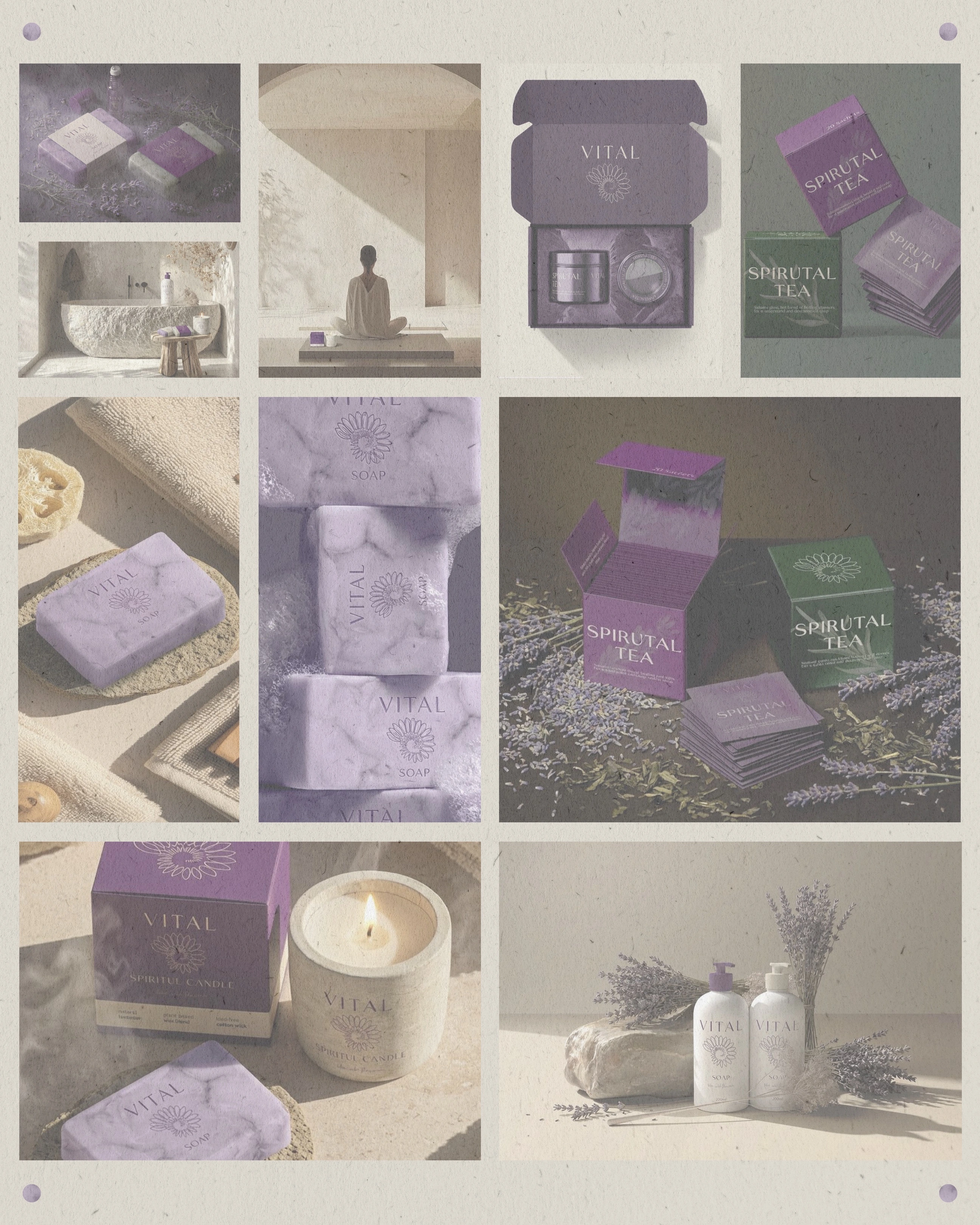
The details
make the family.
A closer look at the supplied Phase 1 product studies. Formats, colourways and composition variants are shown as design explorations, not as evidence of final manufacturing or product performance.
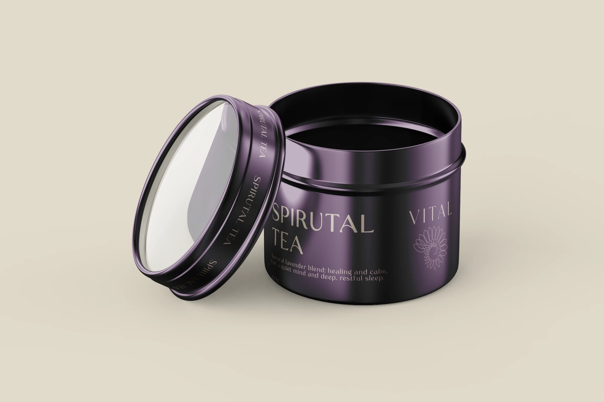
The mark,
up close.
Original supplied label artwork shows how the wordmark, floral spiral and small handwritten line sit together. The layouts remain faithful to the source artwork.
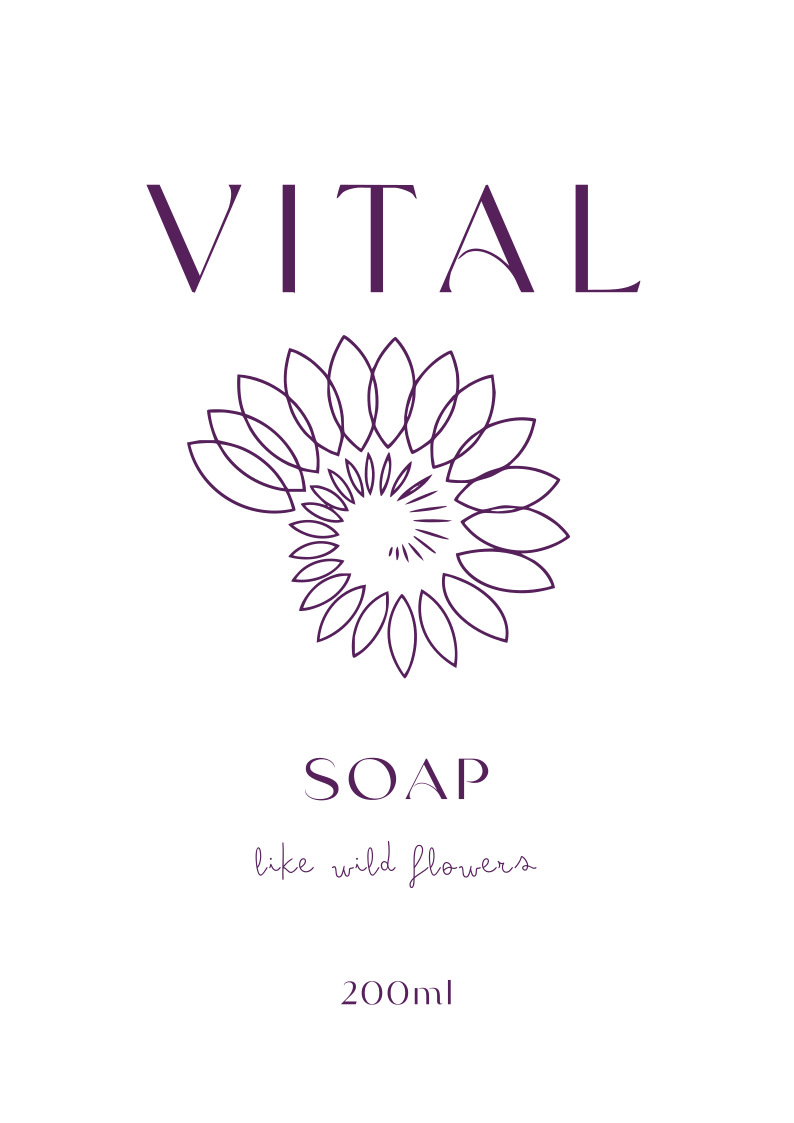
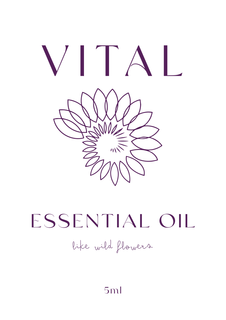
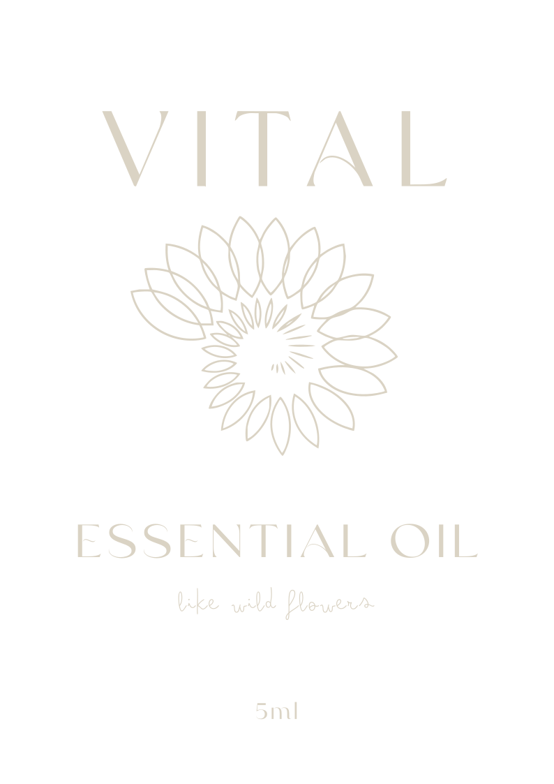
Original label lettering and sample packaging are preserved as design artwork. Editorial captions describe the visual work, not product formulations or benefit claims.
The original
product lookbook.
Browse all fourteen pages of the supplied product-sample presentation, in their original order. Use the arrows or left/right keys.
01 / 14Opening
Designed for
the quieter moments.